[CASE STUDY]
A2A Check — Homepage Audit for a Security Startup
- Category
- UX Audit
- Year
- 2026
- Client
- A2A Check
- Live site
- a2a-check.com (opens in a new tab)
Context
A2A Check is a security product that scans the configuration of AI agents used by companies — like Claude Code, Cursor, and others — and flags where things could go wrong. The product sits in an early pilot phase, with a technical foundation that’s unusually honest and well-built. The team came to me with one question: does the website land with the right people?
The target reader is a managing director of a small or mid-sized company. Not technical, but responsible for what runs in-house. They scan for 10 seconds in the hero before deciding whether to keep reading.
My Role
A two-hour UX audit, desktop and mobile, German version. The brief was eight concrete questions about where the site works and where it drops the target reader. The deliverable: a prioritized report with 15 findings, ready-to-ship copy, and a separate list of what should stay untouched.
Approach
Three passes through the site from the perspective of a non-technical founder. First a 10-second hero scan, then section by section on desktop, then on a 375-pixel phone width. Every finding split into observation and suggestion, prioritized high / medium / low. Copy suggestions written out word for word so the team could paste them in.
Selected Findings
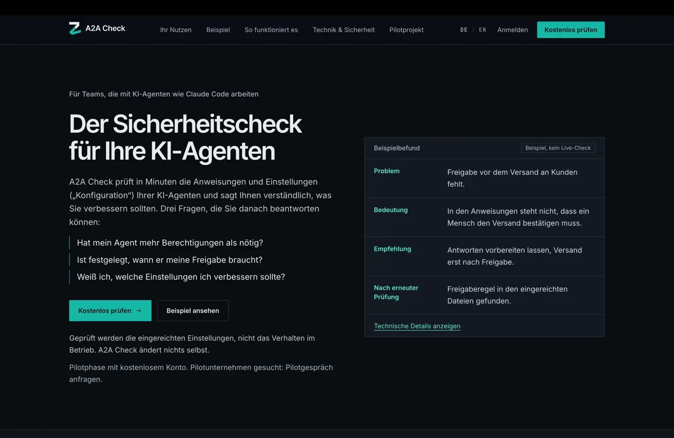
The target reader filters themselves out in second three. The eyebrow above the headline named a developer tool. A non-technical founder reads it and thinks: not for me. Fix: move product names out of the entry point into trust sections further down.
The main CTA promises action, delivers instructions. “Check for free” led to a page of terminal commands and setup steps, not a product. The existing one-click sign-up was already built — the button just needed to point there. One-line fix.
The form can quietly lose leads. No confirmation email after submit. A typo in the address means the interested founder waits forever, the team can’t reply, nobody notices. Fix: double-opt-in-light plus a handful of form improvements.
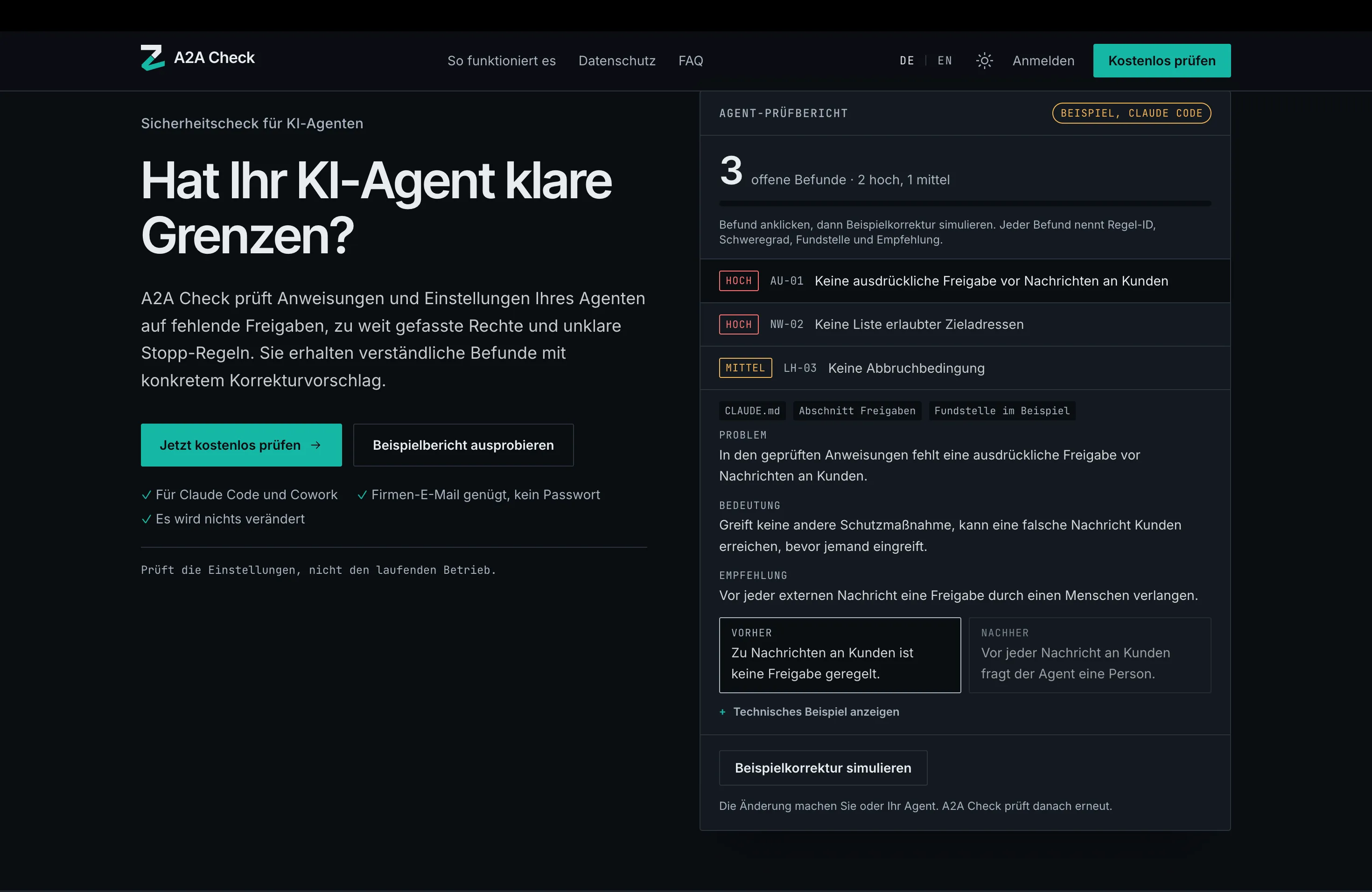
Too much at once. One click on “Show technical details” opened six data rows, a glossary, and a before-after table all at the same time. Test reaction: “that’s overwhelming.” Fix: two-step disclosure, inline tooltips for terms.
Result
15 prioritized findings with ready-to-ship copy, delivered two days before the deadline. Signed off by the client on the same afternoon it landed. The product is live at a2a-check.com.
Takeaway
For technical products, the problem is rarely the design — it’s the language. The most important question in an audit isn’t “does this look good?” It’s “where does the real target reader fall off?”